Barebells - Promotional Website
User Interface Design II Class
Overview
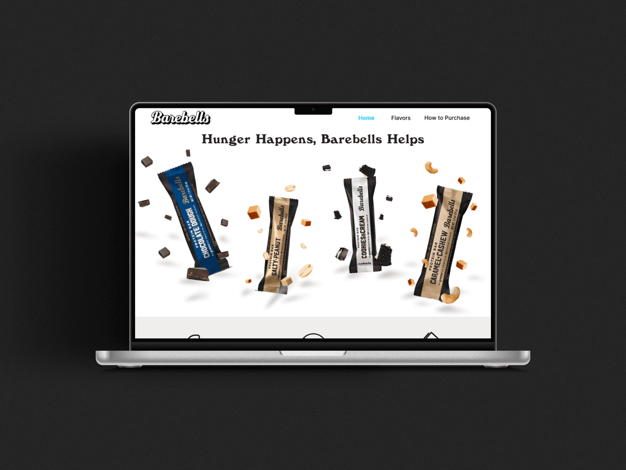
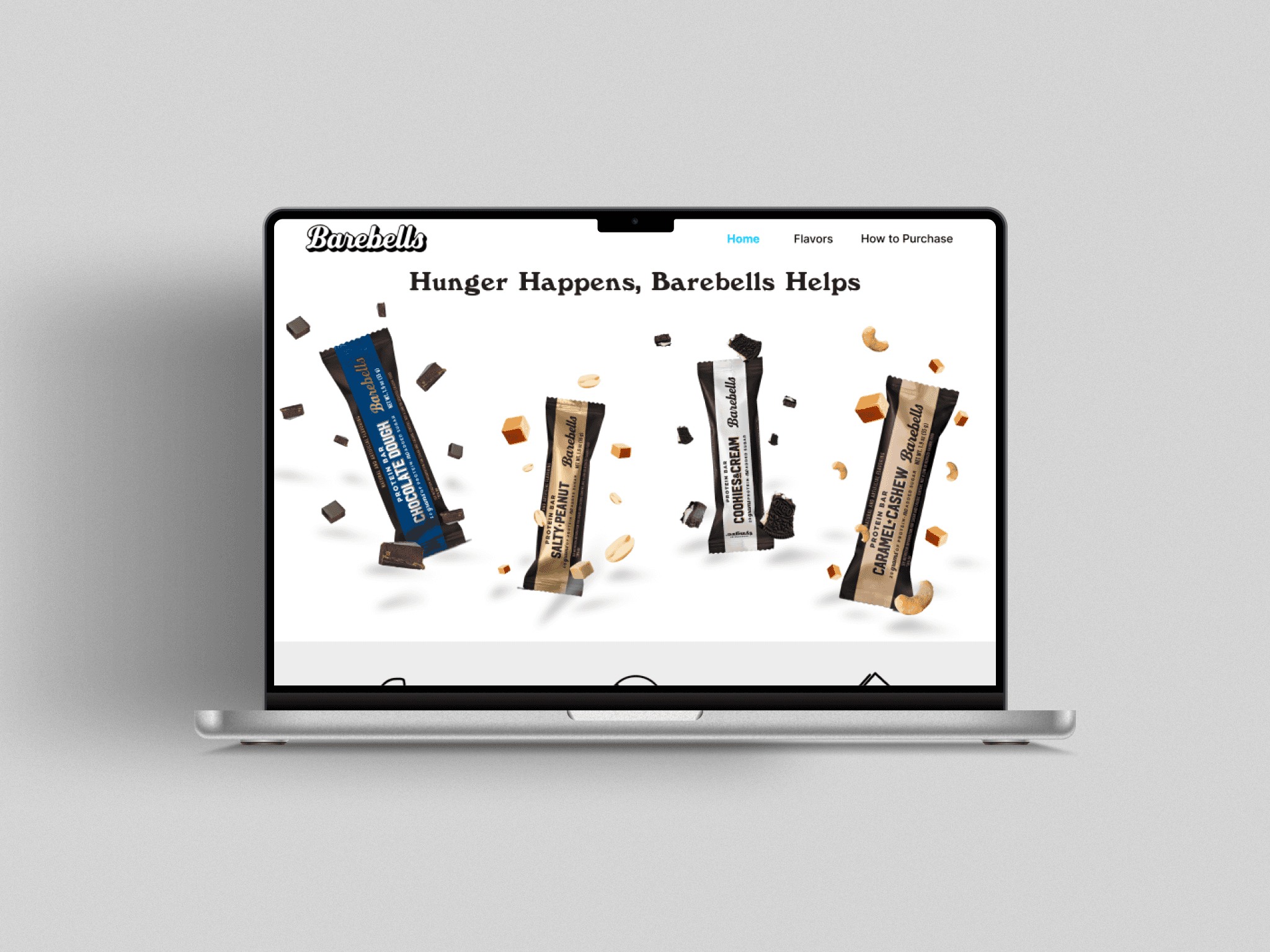
This project focuses on designing a promotional website for Barebells, a brand known for its protein bars as a healthier alternative to traditional chocolate bars. The goal was to create an engaging, user-friendly experience that highlights the brand's products, benefits, and purchasing process.
By applying industry-standard design principles, the project demonstrates how thoughtful UI design can enhance product discovery, simplify navigation, and encourage user engagement.
Method
User Interface Design
Instructional Design
Timeline
6 weeks
Role
UI Designer
Tool
Figma
Project Overview
For my User Interface Design 2 course, I designed a promotional website for Barebells, a brand known for its protein bars as a healthier alternative to traditional chocolate bars. This was an academic project, and I am not affiliated with Barebells.
The website includes sections that:
Highlight popular flavors with engaging visuals.
Offer step-by-step tutorials for purchasing.
Ensure a user-friendly experience through clear navigation and design.
To create an intuitive, professional interface, I applied UI design principles, including:
Zeigarnik Effect: Using progress indicators to keep users engaged.
Multimedia Principle: Combining text and visuals for better understanding.
Miller’s Law: Presenting information in smaller, digestible chunks.
Project Process

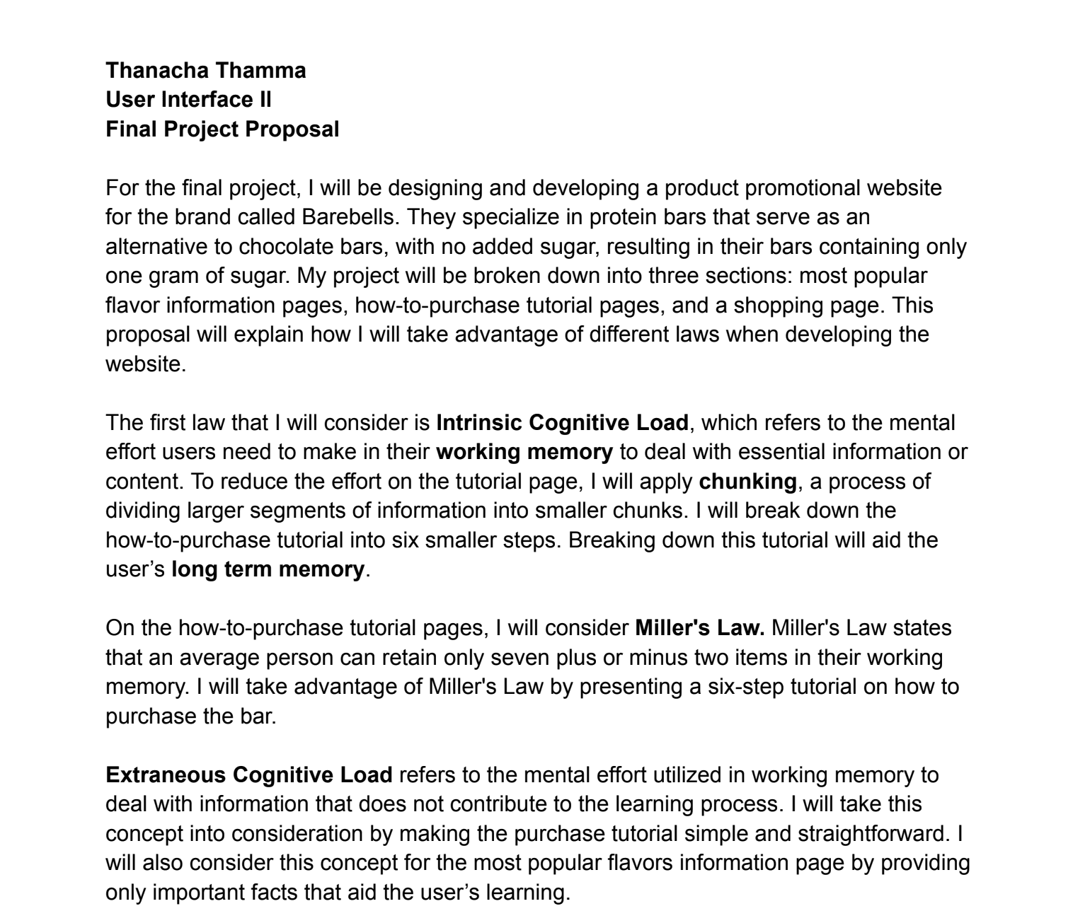
Project Proposal
This proposal outlines my plan to apply UI principles in designing a promotional website for Barebells, showcasing their protein bars as a healthier alternative to traditional chocolate bars. The design focuses on highlighting popular flavors and providing step-by-step purchasing tutorials, ensuring an intuitive and user-friendly experience throughout the site.
User Interface Principles
Zeigarnik Effect
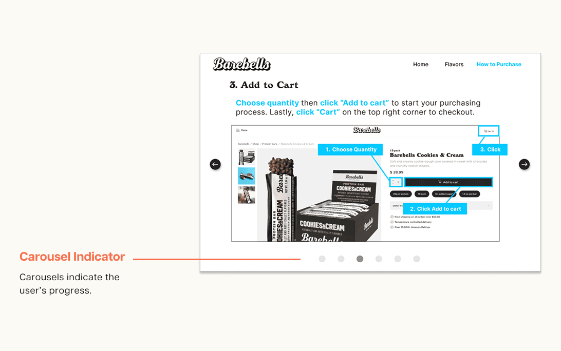
The Zeigarnik’s Effect states users are more likely to remember interrupted, uncompleted tasks more than completed tasks. Carousels (page indicators) will be included at the bottom of each tutorial step to indicate the user’s progress, each of the carousels change color based on the page the user is on.
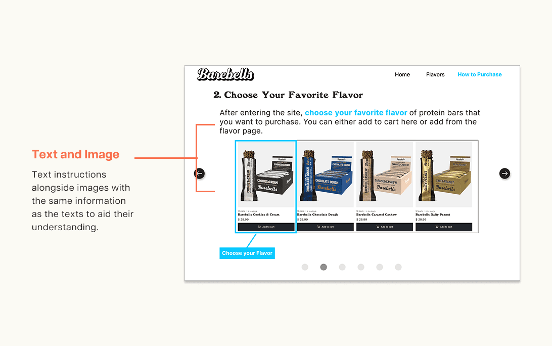
The Multimedia Principle
The Multimedia Principle states that people learn better when there are texts and images rather than just texts alone. This concept was applied in the how-to-purchase tutorial steps. Users will have text instructions alongside images with the same information as the texts to aid their understanding.
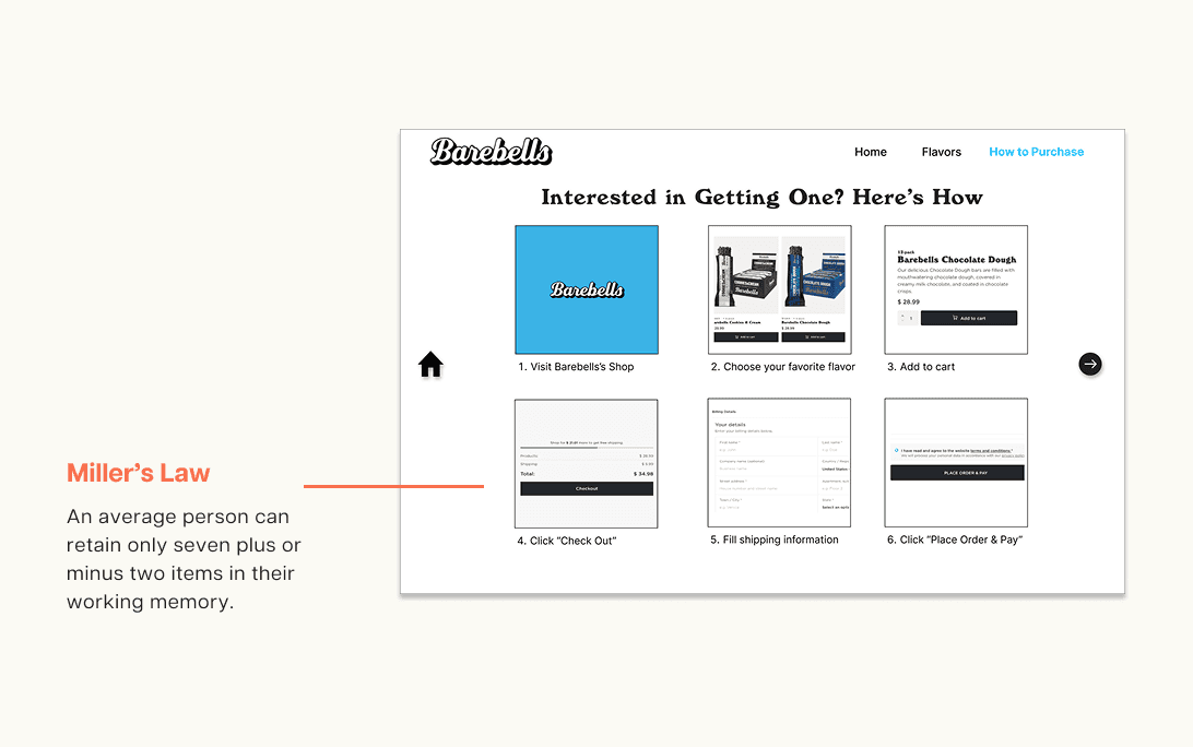
Miller's Law
Miller's Law states that an average person can retain only seven plus or minus two items in their working memory. This concept was applied by presenting a six-step tutorial to keep it simple for users.
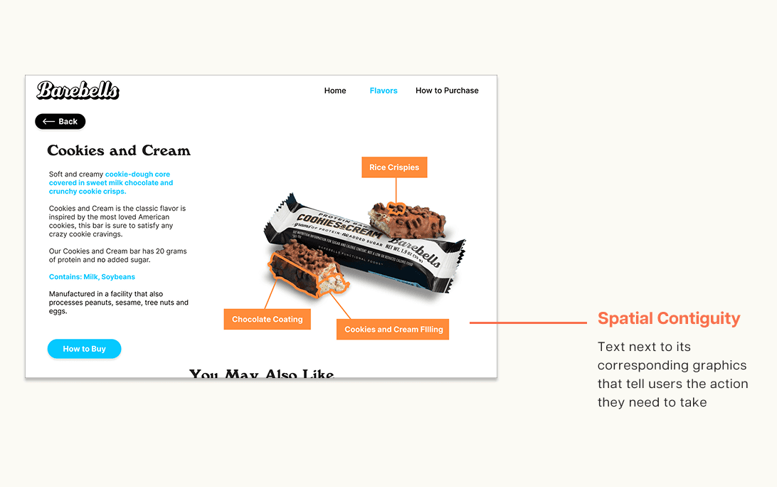
Spatial Contiguity Principle
The Spatial Contiguity Principle states that users learn better when corresponding text and graphics that are close to each other help the user to understand the image. This concept was applied in the how-to-purchase tutorial pages and flavor information pages. In the tutorial the text “click” next to the graphic pointing to a button will make it easier for users to know where they need to click to complete the step.
Final Prototype
For the final prototype, I created a promotional website for Barebells. The website featured sections highlighting popular flavors and purchase tutorials. Throughout the process, I applied industry-standard design principles to ensure an intuitive, professional, and friendly user interface.